|
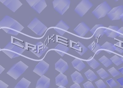
Cracked (PC) by Inphernic
[nfo]
|
||||||||||||||
|---|---|---|---|---|---|---|---|---|---|---|---|---|---|---|

|
|
|||||||||||||
|
popularity : 57% |
|||||||||||||
alltime top: #61321 |
|
|||||||||||||
| added on the 2005-07-30 00:23:42 by diver |
||||||||||||||
popularity helper
comments
umm.. yay. (not to discourage you from making more intros, just unimpressed by cubes and 5x5 sinescrollers)
sucks added on the 2005-07-30 00:28:15 by phoenix 
i am not sure... first one okay... but this is very few stuff... hmm k
nice but not enough. 4k competition is the core discipline of todays demopartys. not a good idea to start here ;)
Lame scroller: sucks.
I like the cubes, but a demo ain't made of cubes :D
Nowadays it's made of triangles :P
I like the cubes, but a demo ain't made of cubes :D
Nowadays it's made of triangles :P
The screenshot above is all one gets to see. Uninspired, but trying to make a 4K production as a first effort is interesting. More use of GM piano sounds. *sigh*
ok as a first try.
you say you've run out of space for that one, it's your first prod... you're not using NeHe's framework for a 4k, are you? :D
eventually rewrite it from scratch or strip all checks at least. you don't need them.
write code in a size-oriented way and finally, use a better packer (eg 20to4).
encouraging thumb up :)
ok
Thanks for the feedback so far, let's see if I can come up with something better for the next one.
I can understand people being umimpressed by this one, when comparing to - uh - anything else? :) I was a bit surprised myself when I saw that this had qualified.
And no, I'm not using any premade frameworks, this is something I've done myself from scratch.
I can understand people being umimpressed by this one, when comparing to - uh - anything else? :) I was a bit surprised myself when I saw that this had qualified.
And no, I'm not using any premade frameworks, this is something I've done myself from scratch.
Cute. Cubes are nice.
nice scroller and cubes - it's no monster 4k, but what it did, it did decently.
There is a first time for everything..
no.
thumb up
I kinda liked it. Too simple for a thumb up though.
well, the sinus-scroll is bit weird, the waves are almost static...
Don't hate it nor falled in love, piggie for not bothering me :)
Good first prod, ignore the thumbs down. Work on some other effect that you wanna do now (:
it's better than this Driftwood thing, at least it is not as long...
how do you say it.... "lame"?
Simple and not so bad. The shading on the cubes looked good.
WHERE IS CRACK :(
where's the amiga version???
submit changes
if this prod is a fake, some info is false or the download link is broken,
do not post about it in the comments, it will get lost.
instead, click here !
.png)